Menu board featuring the protagonists and all dateable characters (marriage candidates) in the game.

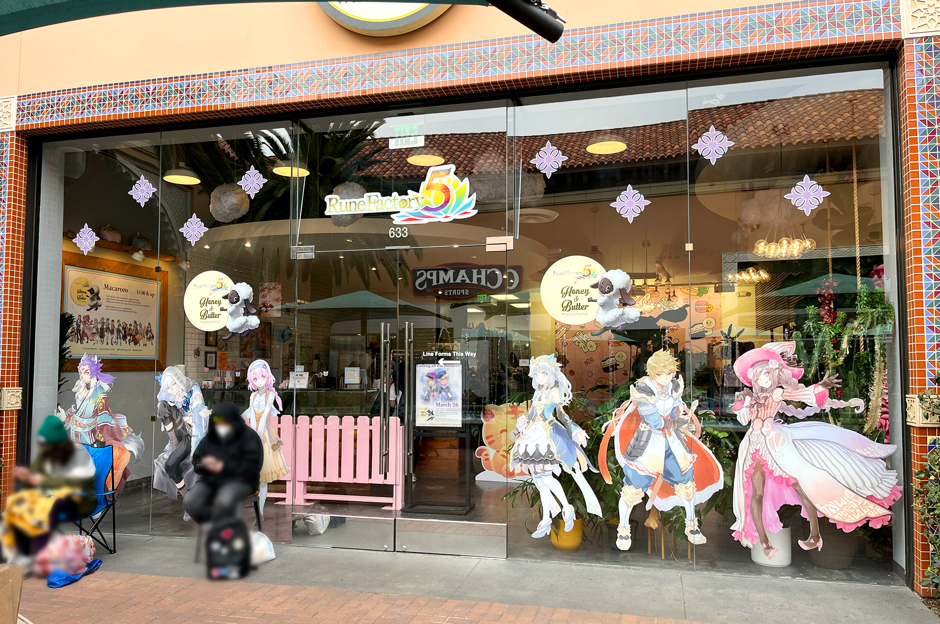
Store Front Design with Window Clings
Designed the store front featuring window clings with characters selected based on popularity from poll results in Japan and research from the Community and Localization teams. Inside, the menu board and display poster are visible. The ornamental window clings were carefully chosen to enhance the game’s aesthetic, helping to reinforce the look and feel of the game and attract attention from passersby.
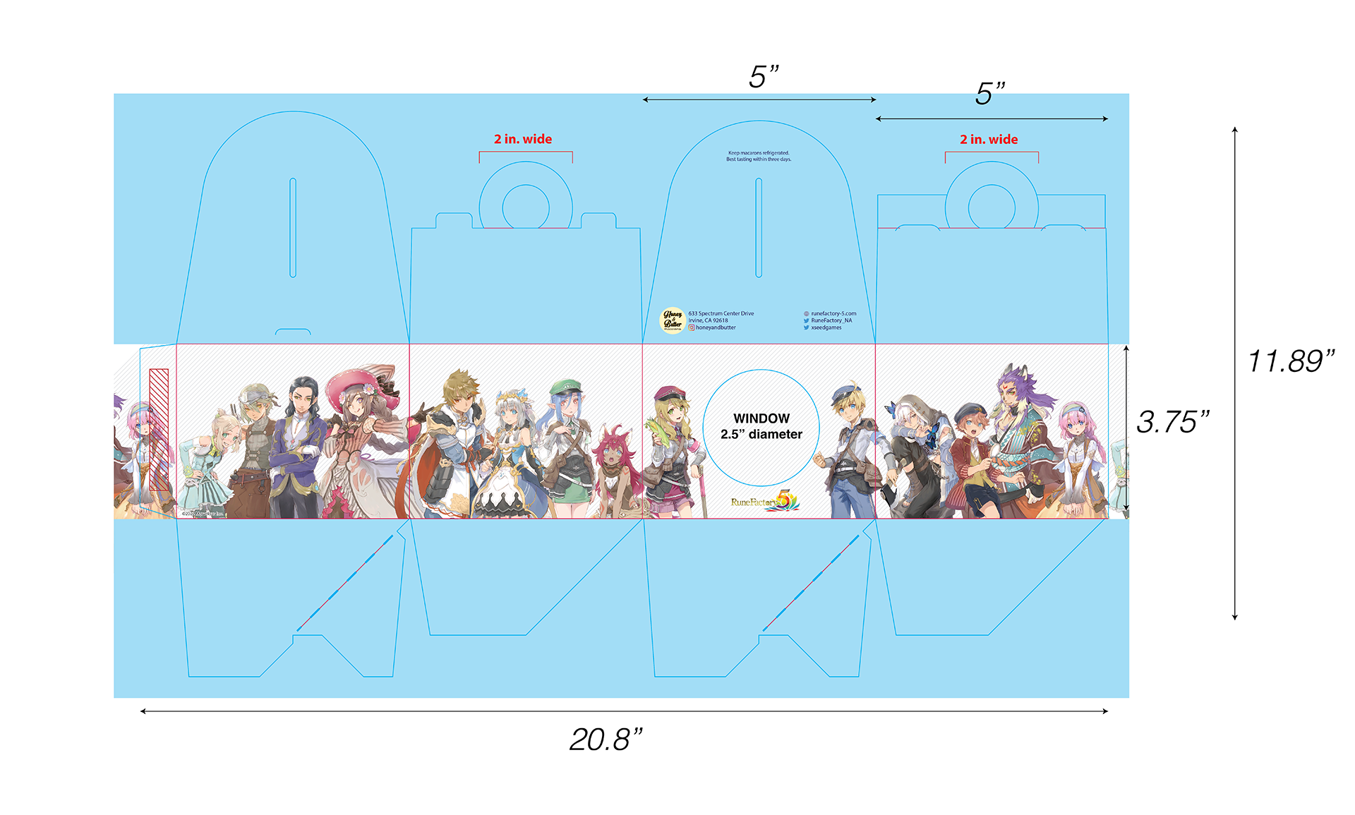
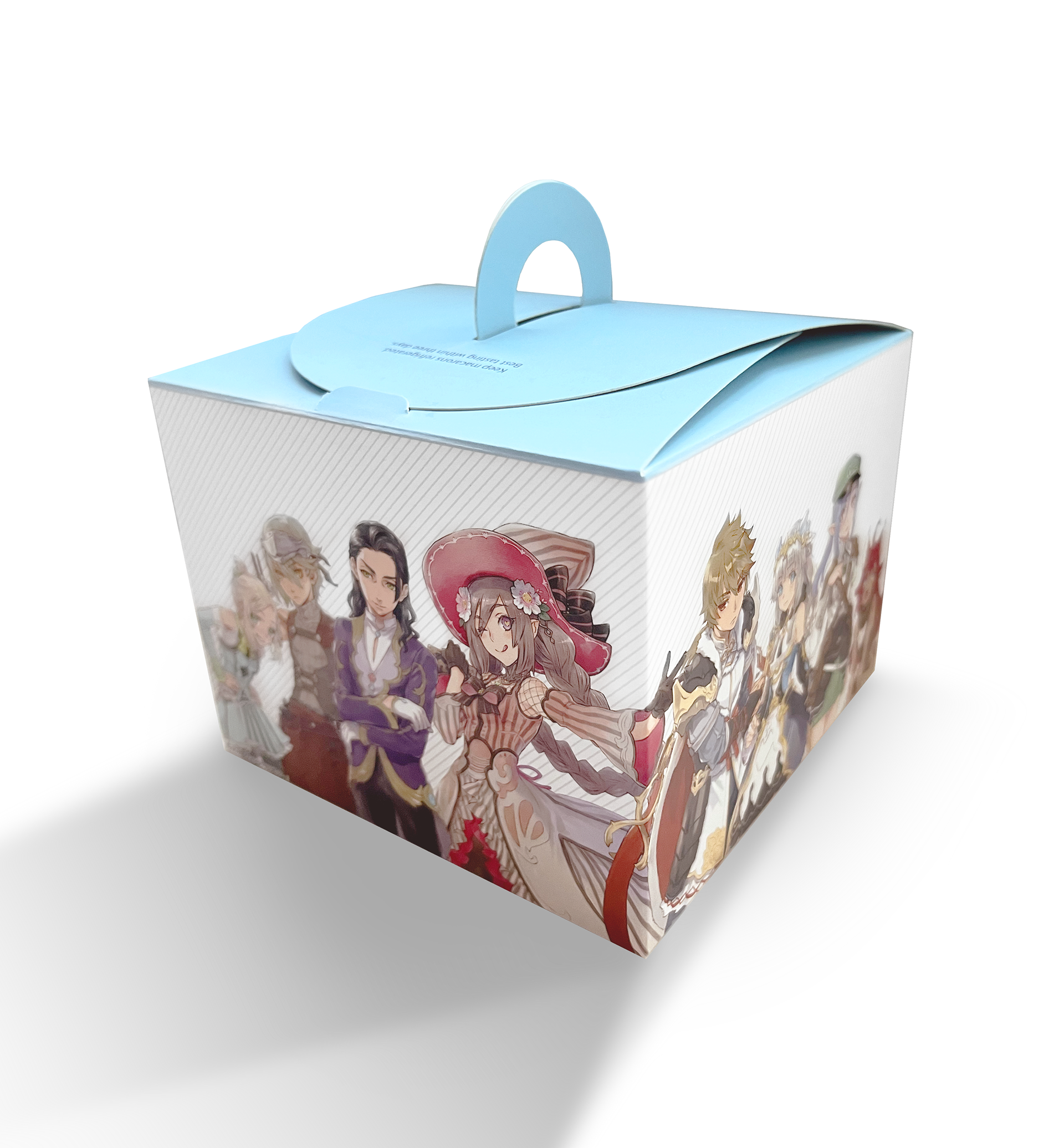
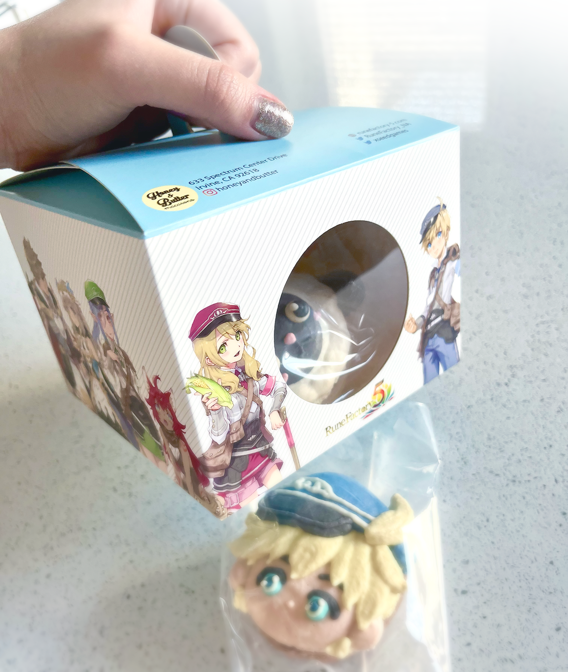
Tote Box Packaging Design
Designed the tote box packaging for Honey & Butter, with dimensions and a template provided by their team. The box is used to package macarons, and I aimed to make it a collectible item for customers, particularly for fans of the characters. To create a 360º experience, I wrapped the character art around the entire box, allowing viewers to discover something new on each side. The characters were strategically placed with a balance of pink, blue, and purple tones to complement each other. To keep the focus on the character art, I kept the design simple with gray diagonal lines in the background and blue accents on the top and bottom sides.
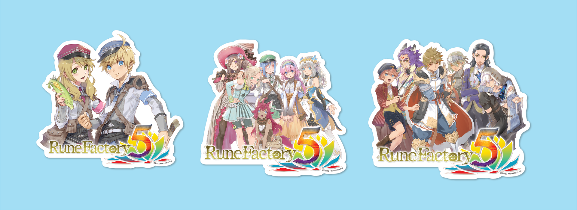
3-Inch Vinyl Stickers
Designed 3-inch vinyl stickers given away with each purchase of character macarons. Each sticker featured individual character assets, which I arranged to fit within the size constraints of the sticker. The design included three variations: the left sticker showcased the two protagonists (with the option for players to choose their gender), the middle sticker featured all female marriage candidates, and the right sticker displayed all male candidates.
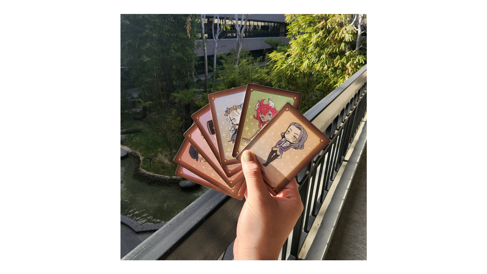
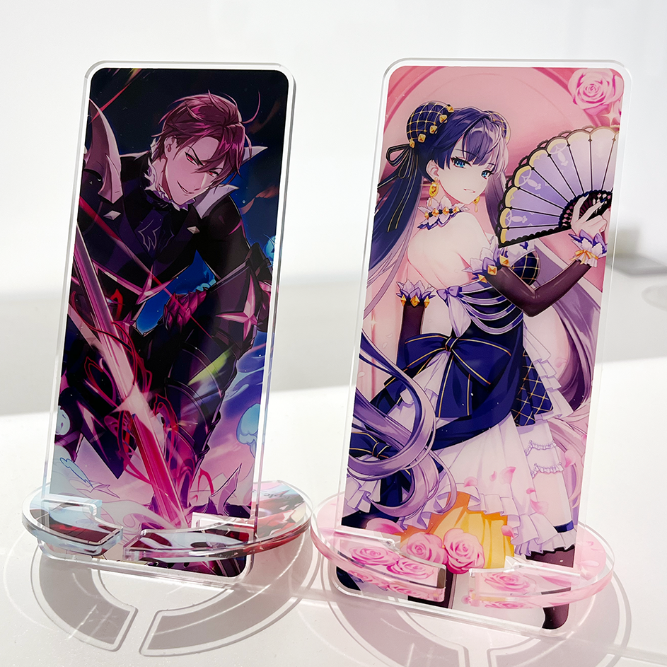
Trading Cards for Marriage Candidates
Designed trading cards featuring 6 of the 12 marriage candidates. Each card includes a QR code that, when scanned, triggers an AR filter animation of another marriage candidate on Instagram. The background lines match the box design, and the character backgrounds use rainbow colors from the game's logo, ordered from yellow to red. The brown border mirrors the back of the card’s box inspired by the game's storage box and wooden windows.


I illustrated the box, drawing inspiration from the game's storage box and wooden window elements.